How FM engineered its new brand name and logo
A bold new look for the future, with inspiration from the past

Zachariah Allen saw things others didn't. Back in the early 1800s, Allen invested in state-of-the-art fire safety improvements at his Rhode Island textile mill. But when he went to his insurance company for a break on his premium, he was rebuffed. So he struck out on his own, creating an insurance company owned by its policyholders.
The model spread across the country, then the world.
In 1999, several companies that followed the model merged to become the Factory Mutual Insurance Company, known for the next 25 years as FM Global.
In July 2024, this story that began almost 200 years ago in Rhode Island opened a new chapter: We're dropping the "Global" from our brand name. We'll still have a global reach, but now our brand name will simply be FM. And we're refreshing our logo. Out with the ellipse and serif fonts, in with bold, faceted letter forms. The new brand identity was created with growth consultancy Prophet, FM's strategic and creative partner.
"It's engineered. It's bold. It's innovative. And the F and the M are united," Kaydee Marcinek, FM's chief marketing officer, said at our brand launch in mid-July from Paris.
"It's engineered. It's bold. It's innovative. And the F and the M are united,"
Kaydee Marcinek, FM's chief marketing officer
Much about our company will remain the same, as it was in Zachariah Allen’s day – most importantly, our commitment to progress and our relentless focus on seeing things that others don’t.
But some things, to be sure, are changing. In this Q&A, Rebecca Marino, FM’s senior brand strategist, and Jill Hambley, vice president of integrated marketing and brand, explain how we engineered our new look and feel.
Why we’re dropping ‘Global’
Last time we redid our brand, when we became FM Global a quarter-century ago, we were trying to establish ourselves on the international stage. Big companies at the time would often use an ellipse as a design touchstone. These days, “global” goes without saying. Announcing it from Paris says it well enough.
By dropping the word "global" and its associated design elements from our logo – by simplifying and streamlining it – the letters F and M can be bigger and more prominent. That makes the logo easier to recognize, explains Hambley.
"If you want to build awareness, you need a logo that is clear, clean, large, easy to see and hard to forget," Hambley says.
The shapes and colors
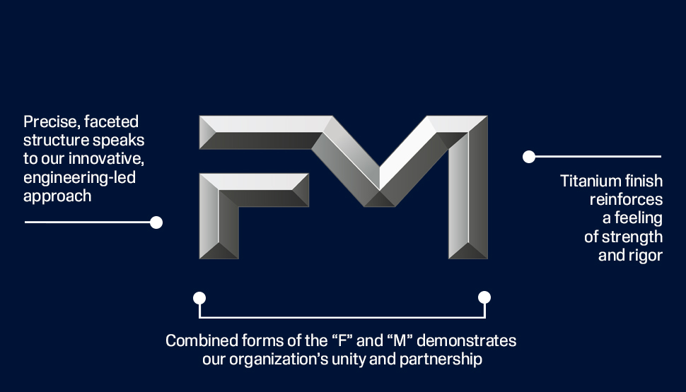
Our new logo has an unmistakably sturdy feel – no surprise for a company grounded in engineering.
But it took some internal engineering to get there. The design process started with about a dozen “discovery areas,” Marino says. Then we drilled down to a few. An early version of the one we ended up picking was flat. To achieve something diamond-like, denoting strength and dependability, we added facets.
"I thought it was really strong already, but when it became faceted, I just sat back and thought — this is it," Marino says.
To account for the edge and lack of color in the steel elements of the logo, we’re pairing it with a stable blue “steel” and an energetic and vibrant orange.
“That pairing is the perfect juxtaposition for our company,” says Marino. “We've got the solid, stable background with these sparks of magic.”
Other subtle messages
Some corporate logos have subtle design elements that you might not notice at first. Ours is no different: The letters evoke the protective strength of steel girders. The shadows in the facets give it a three-dimensional feel. But the letters are also joined together in one form, suggesting our commitment to partnership.
“The enduring bond between the two letters is a really nice reflection of who we are as a company and how we work with our clients,” Hambley says.
All of it was meticulously and thoughtfully designed with Prophet, which became an extension of the FM team, Hambley says.
One last thing was more of a “happy accident,” as Marino calls it. It wasn’t intentional, but it’s unmistakable once you notice it: The negative space under the F and the M evokes a factory.
Says Marino: "For me, it hearkens back to our roots."
